In the decade before & after the turn of the 20th century when Eugene Atget did most of his work there was, it seems, less stuff in the world. The Parisian street windows he photographed seem quaintly minimalist.
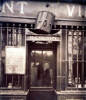
"Au Tambour" by Eugene Atget
Although Parisian commerce, then as now, was surely no stranger to self-promotion, the signs seem mostly limited to “what it is” (butcher, haberdasher, wine, women’s lingerie) & “what it costs” (handwritten on a slate or printed on small placards).
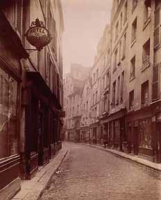
Eugene Atget
Sometimes Atget's signs are actually hard to find, as in this graceful shot of a curving street lined with ground floor shops but only a single advertisement for a hotel.
By the 1930s in the U.S. capitalism was more unbridled. Walker Evans, who consciously modeled his aesthetic after Atget, loved signs. He enjoyed photographing what he called “the pitch direct” of storefront businesses.
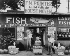
Walker Evans
Signs in the 30s were still mostly the province of sign painters, a proper trade, but many people couldn’t afford them & made their own. Evans seemed attracted to the quirkiness & ambition of these efforts. Never without some ironic distance, his approach was nevertheless generally affectionate.

Margaret Bourke-White
It was left to Margaret Bourke-White to make a powerful critique of racial attitudes with her famous 1937 picture of black people waiting in a long line for relief supplies under a government billboard of a smiling white family enjoying “the world’s highest standard of living.”
Robert Frank, who called Walker Evans his mentor, also made pictures of signs -- and flags. But by the time he shot The Americans in the late 1950s signs had acquired a new meaning.
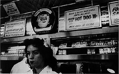
Robert Frank
In The Americans Frank seems faintly disgusted by signs . To him they seem a hectoring background mockery of the actual lives people live. In his view American life is melancholy and sometimes desperate, played out against the chattering of signs that were by the 50s already ubiquitous.
And what about photographers today? Some find the modern onslaught of signs offensive & try to work around them. Others include them in the frame but try to cut off or scramble the messages, decapitate the logos. It's probably safe to say that most street shooters & photojournalists -- essentially realists, after all -- feel they have to include signage in their depiction of modern life. But very few set out to directly tackle our up-to-date versions of "the pitch direct" and the cultural reality of rampant consumerism. I'll mention two.
Andreas Gursky seems to regard signage with the same magisterial curiosity he brings to everything else. The godlike eye of his photos records vast spaces in meticulous, mind-blowing detail but the only emotion we can discern is -- detachment.
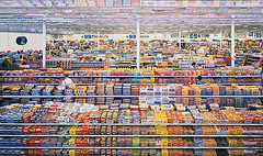
Andreas Gursky
His "99 cents" is 7 feet high by 12 feet across (the small jpeg above is only a reference). Looking at the museum print, a viewer is stunned. He can read the labels on the cleaning products; he can find out the prices on the candy bars. It's a tsunami, an avalanche of signage. But the picture is somehow not disgusting or threatening; it's not even annoying. Far away, precisely ordered, colorful, it could even be considered attractive -- like a coral reef first spied through clear water by a scuba diver. Gursky shows us this without comment. In his quiet affectless way he amazes us. Our jaw drops open. What hath man wrought?
Brian Ulrich takes on consumerism from ground level. A Mother Jones photo essay from his Copia series, "...a long-term photographic examination of the peculiarities and complexities of the consumer-dominated culture in which we live," prowls through malls, stores, markets, shops, all the places we buy things.
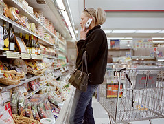
Brian Ulrich
Many of the shots in "Copia" are portraits. Ulrich has a knack of capturing his subjects in bemused states as they contemplate their purchases, but there is nothing alien about these people. They are us & the wraparound display in which they are ensconsed is our new human environment. Signs? Oh yeah, now that you mention them, sure. But it's home.
4 comments:
Andreas Gursky and Walker Evans may be more closely related than I would ever imagine, at least in the two examples you show. There's beauty in them thar fonts.
Ted, When I was looking around for material on Walker Evans I came across a show at the Tate that puts the two together along with a lot of others under the title "Cruel & Tender." Page is here: http://www.tate.org.uk/modern/exhibitions/cruelandtender/. Here's the blurb:
"‘Tender cruelty’ is how the writer Lincoln Kirstein described the work of American photographer Walker Evans in the 1930s. Evans’s images were spare and factual, but his interest in the subject matter was always evident. Evans, along with German photographer August Sander, provides the historical axes for this exhibition, which explores the realist tradition within twentieth-century photography. The photographers chosen are united by this sense of ‘tender cruelty’, an oscillation between engagement and estrangement in their work. The result is a type of photographic realism that avoids nostalgia, romanticism, or sentimentality in favour of clear-eyed observation."
Great post Tim. Looking forward to more.
tom meadows
Cool piece. You've highlighted some beautiful work. Thanks for the links.
I think it's hard to make a photo with signs work as art unless one is clever. I tend to like it when the signs are part of the context or part of an interplay with another focal point. I'm less interested when they are the main point. Somehow feels like a cheat to make someone else's work one's own.
Post a Comment