Showing posts with label Photohistory. Show all posts

Wednesday, August 13, 2014

Critical mass: Writing something a lot of people are thinking

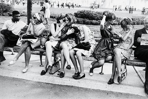
WorldsFair64_Winogrand
"New York World's Fair, 1964," Garry Winogrand, All rights reserved

To conclude his review of the Garry Winogrand show at the Met (editor's note: Winogrand's images are mostly unplanned shots of strangers going about their lives, like the example above), New York Magazine art critic Jerry Saltz wrote the following:

"Something we’ve been missing also becomes evident here. The whole world is now filled with incredible images—especially on Instagram and other social networks—that owe something to Winogrand’s, documenting life, change, and all the rest. Yet the art world and museums are not. Instead they tend to show oversize, very still pictures or images that investigate formal properties and ideas of display and presentation. I love many of those pictures, but what’s happening online on social media deserves far more serious scrutiny than it’s getting. If the art world doesn’t admit more of this sort of deceptively casual-seeming work, the outside world will reject more so-called art photography than it already does. That’s a divide that we don’t need to reestablish and widen."

About time.

Saturday, July 19, 2014

Garry Winogrand: Mundane mysteries, clearly stated

"Six" by Garry Winogrand at Pace McGill Gallery

Review by Tim Connor
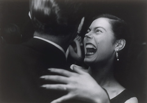
Winogrand_ElMorocco,NY_1955
"El Morocco, New York City, 1969" by Garry Winogrand

Pace McGill’s Garry Winogrand show, “Six,” might be thought of as a kind of Cliff Notes for the full-dress Winogrand career retrospective running this summer at the Met.  At Pace McGill, Winogrand’s well-known prints are large and crisp, and the crowds are minimal, but how much, after all, can one learn from an outline? 

Six images have been chosen for each of six categories  -- Animals, Public Relations, Street, Women, Central Park and Texas.  Aside from providing the title for the show, this 6 X 6 arrangement seems arbitrary and unimaginative for work that openly – even ferociously -- eschews any kind of shot-list mentality or after-the-fact categorization.  But perhaps curation is beside the point. These are Winogrands, and Pace McGill wants to sell them (11” x 14” print prices range from $5,000 to $65,000 – most are around $10,000).

To me, those prices don’t seem terribly high in this crazy art market. After all, John Szarkowski, the great photographic critic and kingmaker of the 1960s and 70s called Winogrand “…the central photographer of his generation.”  To be fair, this was by no means a universal assessment at the time – nor is it today. But I agree with Szarkowski, at least to the extent that Winogrand personified, more than any of his contemporaries, a major attitudinal shift toward photography that is still underway.
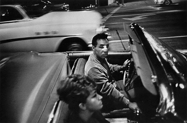
BandagedfaceDriver
"New York City couple"  by Garry Winogrand

Winogrand’s career developed within and against the ideas of an earlier generation of documentary and photojournalistic photographers who believed the best of their work could accurately describe social and historical truth and sometimes even change it. From Lewis Hines through W. Eugene Smith (and continuing today) their theory goes: shine a bright, public light on injustice, and you begin to attack and eliminate it.  This theory was underpinned by optimism. We are all humans with shared needs, problems and joys. And great photography proves it. This was the message of “Family of Man,” the legendary exhibit curated by Edward Steichen, mounted at MOMA in 1955, and then shown around the world.

In fact, Steichen selected two of  Winogrand’s pictures for “Family of Man.” But, from the beginning of his career, it was clear Winogrand was not that kind of photographer. His passion was for the photograph itself -- not for what it represented or could do. He was interested in human stories, but his stories resisted moral judgments.  They could be ambiguous. It was as though he invited viewers to provide their own captions. 

He went out in the morning to make great pictures but had no idea what they’d be. By way of journalistic intention, he followed his interests and obsessions. He went to places and events that he thought would serve him, then, instead of “covering,” them, reacted to whatever caught his attention. He felt no imperative to ask permission before or take moral responsibility after taking a shot. His frames were always sliced from reality, but they took no credit for being reality. Szarkowski called Winogrand’s images “figments of the real world.” First and last, they were pictures.
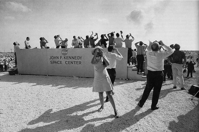
garry-winogrand_KennedySpaceCtr_1969
"Kennedy Space Center, Florida, 1969" by Garry Winogrand
Winogrand is famous for saying, “I photograph to see what something looks like photographed.” And he meant it. The idea was not to take sides or advance an agenda but to discover what his camera had seen. 

An example. Winogrand was against the Vietnam War. Yet his best-known shot of the protests, “Peace Demonstration, Central Park, 1970,” displayed in the exhibit’s Central Park section, shows a dark, gloomy day on Manhattan’s Great Lawn. In the foreground is a spindly, leafless tree. Around it and stretching to a horizon of East side buildings, a vast crowd of anti-war demonstrators sits or lies huddled on the cold ground. The sky above the protesters is thick with newly-released balloons that read as black in the black-and-white print. Perhaps the real balloons were red, not black, against the darkening sky that day. Or perhaps – let’s fantasize -- they were bombs falling. We really don’t know from the picture, just as we don’t know why the crowd is so passive about the spectacle
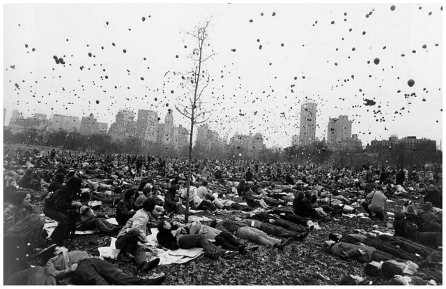
garry-winogrand-peace-demonstration-central-park-new-york-c-1970
"Peace demonstration, Central Park, 1970" by Garry Winogrand

As viewers 44 years later, the scene frankly looks sinister, almost apocalyptic. It goes firmly against our received idea of what an anti-Vietnam War demonstration is supposed to look like. Winogrand’s “historical” pictures are often different in that way. 

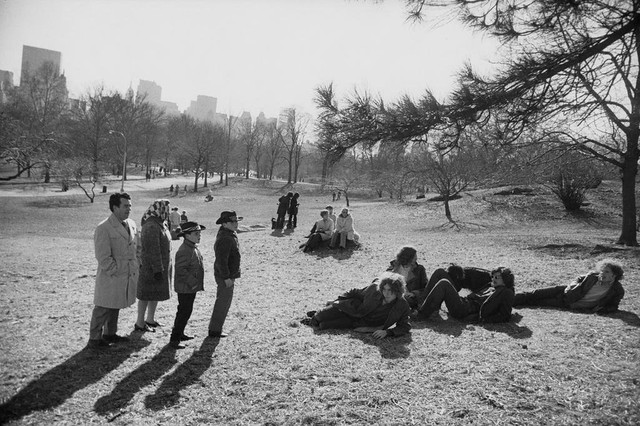
He was in fact a kind of anti-historian. In a 1971 picture, again from the show’s “Central Park” section – and again in cold but snowless weather -- a classic “straight” family of tourists (short-haired father in double-breasted trench coat; wife with hair tied in a scarf; two boys wearing cheap street-bought cowboy hats) stand gazing over five long-haired hippies (hatless, moustached, shades) lounging on the frozen grass. What is the family looking at? Perhaps we're at the outskirts of another demonstration. Why do the hippies so studiously ignore the family? Why do they – the cool insiders -- appear so rattled?   Could it be that, “Somethin’s happenin here but you don’t know what it is…”?  Could it be that Mr. and Mrs  Jones and the kids don’t care?
FamilyVsHippiesWinogrand
"Central Park, 1971" by Garry Winogrand

Winogrand shot without thinking too much – more frames, more rolls, than any of his contemporaries.  Then he edited , selecting what he considered to be the best pictures, not the ones he thought would please. For instance, the disturbing “Easter Sunday, Central Park, 1971” shows three young people obviously tripping, surrounded  by a curious, not necessarily sympathetic  crowd. 

One man is completely naked. His hands are raised, as though he’s invoking the heavens. The other two, a man and a woman, look agitated. There is no caption describing this scene, but the paranoid-ecstatic, staring eyes of all three trippers -- as though they are seeing god and the devil at the same time – tell the tale. 
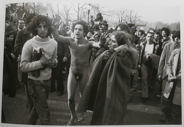
Trippers
“Easter Sunday, Central Park, 1971” by Garry Winogrand

Yes, but why are we looking at this picture? It’s not an anti-drug ad.  It’s also not, in any coherent historical sense, about the event that surrounds it.  In the end it’s just a fascinating “figment” -- at a time when fervently confused religious seekers in New York City might find Easter Sunday an auspicious time to drop acid and attend demonstrations. I guess that’s history too.

Supposedly, Garry Winogrand fell apart as a photographer after he moved to Los Angeles late in life. He continued to shoot but stopped editing, finally even stopped processing his film.  After his death, no less a personage than his old friend and mentor Szarkowski examined the massive take he had left behind – reportedly as many as 300,000 unedited images – and pronounced them unremarkable. Since then, experts at the Met have taken another look and are including some of the unseen shots in their retrospective.

What’s the verdict? Did he lose it? Was he great till the end? I hope so, but it doesn't really matter. Garry Winogrand’s  open-minded, follow-your-instincts, shoot-what’s-there aesthetic recorded the American 60s and 70s like no one else. His example has become the working mode of many thousands of today's shooters – both pros and amateurs -- worldwide. I think it’s safe to say that, working the way he did,  these photographers intuitively understand Winogrand’s  enigmatic dictum: “Nothing is more mysterious than a fact clearly stated.”

This review also appears in the current issue of New York Photo Review.

To read more of my reviews of photography, other visual arts, books and movies, click here.
Saturday, February 22, 2014

"Capa in Color"

Reviewed by Tim Connor


"British soldiers on troopship," 1941, Robert Capa, All rights reserved


Some years ago I decided Robert Capa was overrated. This was an unusual point of view. He was everybody’s mythic macho war photographer. It was Capa who gave out hard-boiled advice (it felt like bullying to me): “If your pictures aren’t good enough, you’re not getting close enough.” It was his famous picture – shot from just yards away – that showed a Spanish Civil War soldier at the instant a bullet killed him. It was Capa who had carried his cameras through the surf with the first Americans to hit Omaha Beach on D Day.

A brave man, certainly. A man determined to bear witness. But what else drove him? From the 1930s to his death from a Viet Minh land mine in 1954, Capa showed us little besides war. In a particularly violent time that worshipped male heroes, he photographed five wars. He was finally killed in the last one. Still, I had my doubts. Maybe what drove Capa wasn’t true idealism, I thought. Maybe it was closer to what drives a big game hunter. Maybe his pictures were more like trophies than acts of witness. I stopped looking at his work.

"D Day, Omaha Beach," 1944, Robert Capa, All rights reserved
I think I was wrong about Robert Capa. The pictures at ICP’s “Capa in Color” exhibit reveal a man more complex and sympathetic –and more talented as a photographer — than my imagined war zone daredevil. And it’s not just because of the color. Around 1940, when Capa first started using Kodachrome slide film, it was still experimental. Processing required a top-secret formula available in just two Kodak labs worldwide. Always a pragmatist, Capa continued to shoot his stories in black and white. But if there was time – and a possible market––he began to back them up with color.

For a 1941 story in The Saturday Evening Post about a British troopship crossing the Atlantic on its way to the war in North Africa, Capa shot everything in both color and black and white. He may have hoped the somber tones of the early Kodachrome would enliven the stripped-down colors of the ship and cargo, designed to avoid detection by enemy planes. He may have planned to isolate the pallid skin tones and brown uniforms in the elegant group portraits he made of the British troops. In any case Capa’s color does something important for the story. It suggests the held-back energy of the enterprise. In Capa’s color, the ship and its men, hunkered down in defensive readiness, seem ready to explode. Kodachrome’s primitive rendering of minimal colors against murky browns and blacks deepens the feeling of tension and dread.

Later, traveling with American troops in Tunisia, Capa used color in a style more familiar to modern viewers. One picture shows soldiers grouped around a captured German tank, draped with a large red and black swastika flag. For the first time we see the force of Kodachrome’s signature red. The bright flag anchors the picture, ironically imbuing it with the high-key colorful optimism we will later see in millions of post-war family snapshots (today the look is back in fashion, available via one-click antique filters for Instagram).

"American soldiers posing with captured German tank," 1941, Robert Capa, All rights reserved
I should make it clear that many of the “Capa in Color” pictures are being shown at ICP for the first time. They never made it into the magazines. There was a catching-up-to-color lag after the war, some of it due to technical and logistical issues, but much of it because editors and publishers insisted on doing things the way they had always done them. Capa’s letters to these eminences, included in the show, reveal a witty and persuasive writer endlessly pitching ambitious story ideas, and mostly, it seems, being turned down. One understands why Capa, along with fellow photographers Henri Cartier-Bresson, George Rodger and David “Chim” Seymour, created the Magnum Photo agency in 1947 to advocate for their ideas.

But after the war, even Magnum had trouble bucking the tide of American self-satisfaction. The show quotes a 1948 letter to Capa from Magnum President Maria Eisner. “We have to face the fact that in general our stories are too big, too serious, and even too good [for the magazines].”

"Pablo Picasso and his son Claude," 1948, Robert Capa, All rights reserved
So Capa struck out in a new direction. With the advent of Holiday, billed as “…a peacetime publication catering to an ideal of post-war American prosperity,” he shot profiles, mostly in color, of old friends from Paris like Ernest Hemingway (Capa seems to have had trouble catching Papa without a drink in his hand) and Pablo Picasso (radiant in his old age, basking in the beauty of his young wife and new son). This is fine work, and, for the first time, we see it as essentially color work. Color is now more than a novelty.


"Longchamps raceway," 1950s, Robert Capa, All rights reserved
I must confess my favorite color images from this show come at the end, after color film had developed a ripe palette for Capa to employ in the European spas, resorts, party towns and film sets Holiday sent him to in the 1950s. In places like Deauville, Biarritz and Rome he chronicled the pleasures of the rich, the beautiful and the lucky with smooth professional enthusiasm. Some histories say Capa did this work for the cash to keep Magnum going – which I don’t doubt – but there’s no denying his appreciation of the good food and drink, the styles and, especially, the beautiful women. This is la dolce vita: Fellini parodied it; Capa reveled in it. It’s arguable that color spreads like the ones he made eventually turned into today’s moronic “celebrity news” in magazines and on the web, but Capa’s early 50s version of paradise is filled with undeniable sensual joy.

"Geraldine Brooks at fashion studio of Emilio Schuberth, Rome," 1951, Robert Capa, All rights reserved

Also appears in The New York Photo Review


Monday, January 20, 2014

The arc of war


"Marines, Korean War," David Duncan, All rights reserved

I remember the first war photograph that got to me. I must have been about 11. It was a picture by David Douglas Duncan in an old Life Magazine of two U.S. Marines, heads ducked down, rifles in their hands, running toward a battle in Korea. The first Marine wore his helmet at a rakish angle and sported a pencil-thin mustache like the young Ernest Hemingway. As he raced past the camera toward possible death, he managed a grim, tiny smile. I was smitten.

I think most, if not all, boys are drawn to fantasies of war. For me Duncan’s picture lit up visions of nonchalant courage and noble sacrifice that were already present in my adolescent consciousness. Later, I learned the photo was an honest depiction. Far from a propagandist, Duncan, an ex-Marine, had covered World War II, then the Korean War –always from the perspective of the troops in the field. Shooting in Vietnam, he had turned against the war and published two photo books — I Protest (1968) and War Without Heroes (1970).

Such attitudes – for or against war — are studiously avoided in “War/Photography: Images of Armed Conflict and its Aftermath” at the Brooklyn Museum. Sprawled across multiple panels, this large, ambitious collection presents over 400 pictures by 255 photographers from over a dozen nations. The curators declare their intention to explore “the general progression – the arc – of every war ” and divide the pictures into sections on “recruitment, training, embarkation, daily routine, battle, death and destruction, homecoming, and remembrance.” The exhibit covers an astonishing 166 years worth of wars — from the Mexican American War (1846-1848) to the recent conflicts associated with the Arab Spring (2010).


"Drill sergeant, Parris Island," Thomas Hoepker, All rights reserved

The curator’s scholarly approach is very good at putting to rest contentious myths about certain well-known photographs. For instance, was the World War II shot of American soldiers raising the flag on Mount Suribachi at Iwo Jima a spontaneous action or premeditated propaganda? It turns out it was a little of both. The flag-raising captured by Joe Rosenthal’s iconic photo was improvised as a way to signal to thousands of troops still fighting on the island below that the mountain had been taken. However, it wasn’t the first flag that had been raised that day. A smaller flag in a less visible spot had been hoisted (and photographed) a short time earlier. The one that became world-famous was a replacement, and, yes, homeland PR was a big part of the reason.

In fact, propaganda (sometimes just natural bias) can be found in pictures from all sides in this show. Famous American photographers like Margaret Bourke-White and Edward Steichen, for example, did their bit for the war effort in World War II by creating beautiful compositions of grand battleships in naval processions and sleek fighter planes taking off, accompanied by the cheers of onlooking troops. It’s hard to fault the photographers’ intentions. That was their job, after all, and, in time of war, they obviously wanted to make their country look good. It is only while looking at pictures of the pulverized landscapes and shattered human bodies these graceful machines can leave behind that one remembers their murderous purpose.

"Untitled," Wesley David Archer, All rights reserved


Easier to classify, if not to forgive, are the fabricators. Before small cameras, fast films and Photoshop, fakes were harder to create than today–– but they were also easier to get away with. In World War I, for instance, a man named Wesley David Archer produced a mesmerizing shot of a war plane in flames with its pilot falling below it through space. The plane’s wings bear the Iron Cross, which would make the pilot German. How marvelous! There was only one problem: Archer had created and photographed the whole scene in his studio as part of a money-making scam. Later, he went on to become a well-known model-maker in Hollywood.

"Valentine with her daughters, Amelie and Inez, Rwanda, 2006," Jonathan C Torgovnik, All rights reserved

Such dishonesty (certainly at the level of posing or on-scene cropping) will always exist in photography, but, to my mind, the most important pictures in this show represent a relentless visual boring at the truth about the real experience of war. This body of pictures has been building up since photographers like Robert Capa began carrying small, versatile cameras to the war zones of the 1930s. It continued through the appalling horror and mega death of World War II and Korea, but it wasn’t until the Vietnam War that truly disturbing images became widely available in the United States. With the publication of Eddie Adam’s photograph of South Vietnam’s National Chief of Police summarily executing a Viet Cong guerilla in 1968 and Nick Ut’s 1972 shot of napalmed Vietnamese children running in agony down a road, the floodgates finally opened. Included in the show are incomparable images by Don McCullin, Horst Faas, Larry Burrows and others, widely credited with helping to end the war.
"Assault with helicopters, Vietnam," Horst Faas, All rights reserved
Today many of us are privileged – and, if we read newspapers and use the internet, even compelled — to look at truly painful color photographs of both combatants and victims from the world’s far-flung conflicts. As this show demonstrates, a steady flow of war images by a loose multinational corps of male and female freelancers is now a given. Surprisingly free from allegiance to ideologies or nationalistic prejudices, most of these pictures honor and grieve both civilian and military suffering. At their most provocative they even open chinks of compassion for the others – the enemies who fight against and try to kill our loved ones.
"Viet Cong soldier, Vietnam," Don McCullin, All rights reserved
Let me give an example. A 10-foot-long full color image from Afghanistan by French photographer Luc Delahaye shows a very young man lying dead in a shallow, dusty pit. He is wearing a thin cotton shirt beneath an empty ammunition vest, baggy pajama-like pants and dusty black socks. His legs are neatly folded like a well-behaved boy. Indeed, if not for the small wound in his neck, he could almost be a gangly post-adolescent boy taking a nap. Then we notice something. He is wearing socks. But where are his boots? Stolen, we realize.Who is this abandoned and desecrated boy?
Delahaye tells us in a single word: “Taliban.”
If I had looked at this picture when I was 11, I would have turned away confused and upset. That’s good.

Wednesday, November 20, 2013

Brandon Stanton's "Humans of New York"

Image3496a
"Humans of New York," Brandon Stanton, All rights reserved

Just a week after its publication, Brandon Stanton’s photo book, Humans of New York, jumped to number one on the Times best-seller list. To make the book, Stanton walked all five boroughs (but mostly Manhattan) with his camera, approached people he found interesting, started up conversations and asked to take their pictures. Not only did the people agree, they opened up for surprisingly unguarded portraits; many also gave Stanton intimate quotes for attribution, as though he was a trusted friend.

Does this sound like a classic New York artist’s fairy tale? Well, it is. And here comes  its modern twist: Stanton was not discovered by a John Szarkowski-style prince of taste but by millions of viewers on the internet. To become the people’s choice Stanton began showing his pictures on photoblogs and social media in 2010.  The last time I visited his “Humans of New York” (HONY) page on Facebook, it had been “liked” by 1,772,196 visitors, and each of the page’s hundreds of pictures had themselves inspired hundreds or thousands of comments.

These are astonishing numbers. What makes the pictures so popular? Certainly, Stanton’s well-made color portraits are uniformly pleasing. Straightforward and unfussy, they fill out a New York City “gorgeous mosaic” of demographic diversity with an eye for individual style and a flair for tripping the shutter at the perfect moment. Perhaps Stanton’s real gift, in fact, is his ability to create that moment – to persuade strangers to feel good about him, his project and ultimately themselves.

In addition, Stanton is a sympathetic interviewer. As he shoots, he asks big questions, such as “What is your biggest struggle?” The answers range from ironic (often very funny) quips to true attempts at self-revelation.  Later, Stanton combines his subjects’ edited answers with their pictures to create funny, swoony or sad little stories.
Image3496b
"Humans of New York," Brandon Stanton, All rights reserved

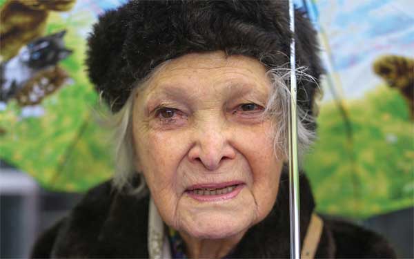
On a rainy street, for instance, he asks a mysteriously smiling young woman, “What was the happiest moment of your life?” The woman replies: “There are two. The day my baby was born, and last night.” Responding to another question, an elegant old woman in a fur hat  looks proudly at the lens and says, “When my husband was dying, I said, ‘Moe, how am I supposed to live without you?’ He told me, ’Take the love and spread it around.’ “

I’m told this collection moves many viewers to tears.  I’m guessing most of these are what people call ‘happy’ tears. Most viewers – like most of the people photographed -- seem helpless against Stanton’s optimistic charm and genuine affection.  In this book, buoyed up by his eager energy, dancers dance, lovers kiss and old grumps laugh aloud.  For a moment this friendly young man seems able to create an experience of deeply-felt community. 

His style, it seems to me, embodies our cultural moment’s  
ideal template for photographic portraiture. Everything is in the open. No pictures are taken without full permission. Editing and usage rights are theoretically collaborative. Recorded words are reliably accurate and respect the true context in which they were spoken. The final photographs represent a synergy of shooter and subject. Posted to the internet, they become a kind of collective. 

I’m guessing that most of Stanton’s subjects felt they were posing under just such an unwritten moral contract (legal realities may be different). No doubt they felt good about it. Stanton’s wide-open, democratic style is the flip side, after all, of the rampant insecurity and paranoia that curls more and more insistently through our high-tech society – and often surfaces around photography. “That man with the camera,” we fret.  “Is he pointing it at us? Is he the government, a stalker, a pervert? Is he looking at the kids?” Such fears may be extreme, but they’re not contemptible. There’s a reason for them to exist.

Image3496d
"Humans of New York," Brandon Stanton, All rights reserved

Nevertheless, as a critic, I’m concerned about this trend.  If photographers and their intentions are forced to endure such fear-driven vetting, will only feel-good, we-did-this-together projects like Stanton’s be able to thrive? I say this as a sincere fan of  “Humans of New York.” I admire its steady, non-judgmental acceptance of its subjects’ offerings. But I worry about photographers who use very different methods and mine very different veins.

levitt_artistcolor2
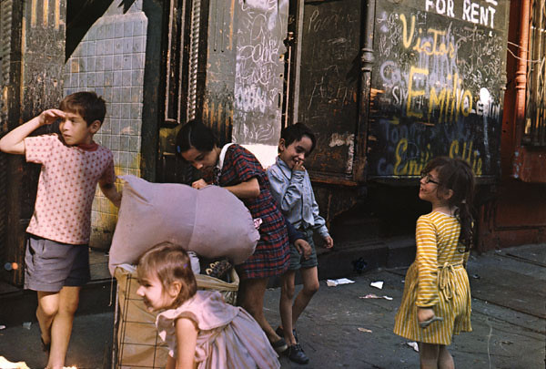
"Lower East Side Children," Helen Levitt, All rights reserved

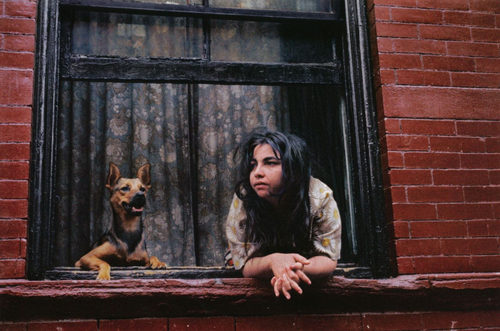
Take Helen Levitt, who died a few years ago. Regularly described as “shy and retiring,” she walked the streets of Harlem and the Lower East Side anonymously for 60 years, photographing and filming people -- most often, children – using cameras fitted with a right angle viewer, called a ‘Winkelsucher,’ that allowed Levitt to stand sideways to her actual subjects. In other words, she snuck shots in pursuit of what legendary author James Agee called “…a fleeting and half-secret world… most abundant in lyrical qualities.” 

tumblr_mvim4rnKDk1qaqnlfo1_500
"Girl at Window," Helen Levitt, All rights reserved

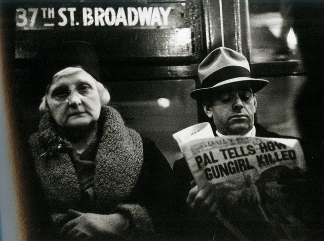
Levitt’s colleague and friend Walker Evans did something similar in his famous subway series, “Many Are Called.” With Levitt often sitting by his side, Evans rode the New York trains for weeks making exposures with a tiny camera through the buttonhole of his overcoat.  Riders among the daily mass migration rarely noticed, but there was nothing dishonest about the pictures. Looked at now, Evan’s pictures, like Levitt’s, are a triumph of humanist affirmation.

WalkerEvans-Subways
"Many Are Called," Walker Evans, All rights reserved

Does “Humans…” give us a truer look at New Yorkers than the street portraits of the past or today's by other photographers?  I’d say it gives us another kind of look – a familiar modern look, balanced on the tightrope between disguise and revelation. Call it a social media look.  My recommendation is: If you can’t afford the book, at least check out the website (humansofnewyork.com). It may be the first big mainstream collection that takes for granted the facebook selves – at once pleading and performative – that we willingly reveal to our linked-up world.

This review also appears in The New York Photo Review

Thursday, May 16, 2013

Martin Parr -- "Life's a Beach." A review

Parr2
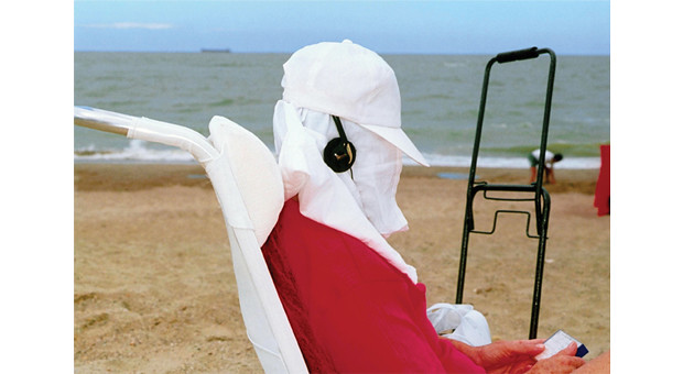
"Knotte, Belgium," Martin Parr, All rights reserved

First, an admission.  Before I looked at  his show, “Life’s a Beach,” at Aperture Gallery, I had convinced myself that Martin Parr’s hyper-bright, in-your-face ironies were mostly an exercise in hype -- a sort of art brand on the make. But I left the show thoroughly charmed.
How did that happen?  Before this, I had only seen Parr’s work sized small, online or in magazines, and had gotten the idea his pictures were supposed to be jokes.  In fact, I enjoy jokes, but Parr’s images had seemed to me detached and over-calculated, like a comedian’s punch lines with choreographed pauses for laughter. Looking in the context of this show’s large prints, I saw that his work is much more complicated than that.
Is Parr’s work funny? Yes, often. Does he shoot as an outsider? Yes, of course.  Parr could never manage his pictures if he was also participating in the dramas swirling around in the frame. On the other hand, he could never get the shots at all if he didn’t have a participant’s instinctive knowledge of what’s going on.

Parr003
"Art," Martin Parr, All rights reserved

I imagine Parr as a participant-observer, a sort of photo primatologist among his peers.  Put simply, he understands  that – released from workaday discipline by holidays or special events – ordinary people behave like the complicated primates we actually are. We gossip, flirt, eat, play games, make jokes, dress up in uniforms and costumes, dance, drink, bask, show off, analyze each other’s status, display awful – if exuberant – taste and so on.  In these settings Parr seems to have found  his gift in another primate ritual. He takes pictures.

In Parr’s career he has showed us ourselves abundantly -- through 50 books and over 80 major exhibitions of photographs, four movies, numerous TV documentaries, membership in Magnum, a co-written scholarly history of photo albums, an extensive post card collection and more.

The man loves pictures.
martin_parr_think_of_england
"Think of England," Martin Parr, All rights reserved


In “Life’s a Beach” Parr has for the first time assembled his best work from a 30-year obsession with photographing beaches around the world. The prints push-pinned to Aperture’s  walls include work from Argentina, Brazil, China, Spain, Latvia, Japan, the United States, Mexico, Thailand and the United Kingdom. For Parr, beaches are “…that rare public space in which general absurdities and local quirks seamlessly fuse together.”
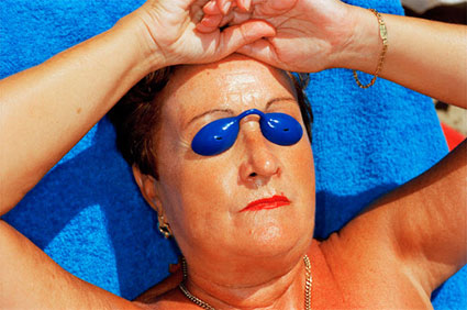
Some of the images are indeed evocative of every culture. Parr’s iconic 1997 shot of a sunbathing older woman, for instance, delivers a maximal satiric jolt by cropping out everything but her glistening, sunburned face and arms. Even in the savage heat of the mid-day beach, the woman wears all her gold jewelry.  Her thin, freshly-lipsticked mouth is pursed grimly, and -- where her eyes ought to be -- surreal bright blue protective eye-cups seem to pop with otherworldly rage.

MParrBlueEyeKillerLadyBlog
"Sunbathing lady," Martin Parr, All rights reserved

Who is this terrifying woman? Why is she so angry? Parr leaves it to our imagination. Every culture has agreed-upon types to refer to. The picture was taken  in Benidorm, Spain -- perhaps the woman is a fierce duenna, strictly chaperoning a family’s sulky adolescent daughter. Maybe the correct title should be dowager –she’s  an updated British version of Wilde’s Lady Bracknell.  Other tribes will assign their own special roles.
MParr_AmericanSpeedoBlog
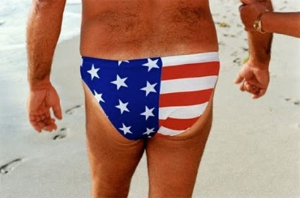
"American speedo," Martin Parr, All rights reserved

MParr_RioBeachBoyBlog
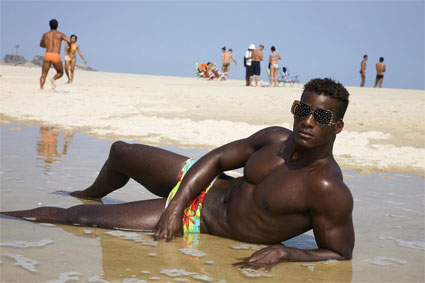
"Rio beach boy," Martin Parr, All rights reserved

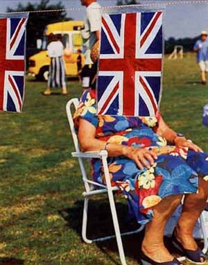
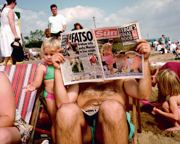
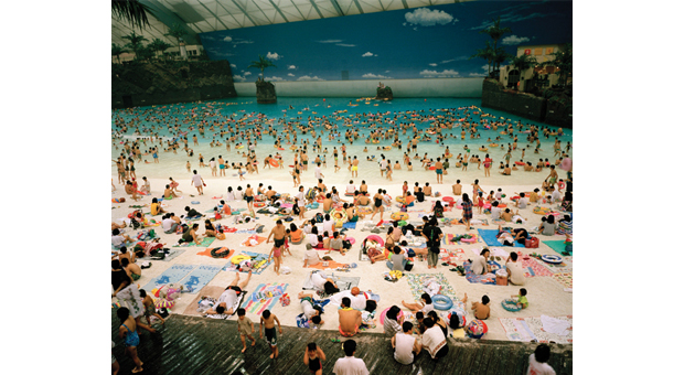
Parr’s pictures also nail specific cultures. A garish stars-and-stripes-themed speedo droops off the sagging ass of a middle-aged man from Miami; a godlike, gleaming black beach boy from Rio sizes us up through designer sunglasses; in places like New Brighton and Eastbourne,  beachgoers in robes and sensible shoes sit in folding chairs and read headlines like “I Want to Hang Them” or “Fergie’s Final Boob;” in Miyazaki, Japan, hundreds of revelers frolic happily in artificial surf under fluorescent lights in a place called Ocean Dome.
martin-parr-sun
"The Sun," Martin Parr, All rights reserved

Other pictures move across the sticky divide between cultures. For example, on a beach in Goa, India, a young Western couple encamped with flip flops and towels are disconcerted by a large white sacred cow, which gazes at them mournfully as two fully dressed Indian men stride purposefully by.
It’s interesting that so few of these cross-cultural shots cause the viewer any real discomfort. The only picture in the show that is at all disturbing depicts a big beefy Western man lounging under a palm tree, simultaneously getting a manicure and a pedicure from two tiny Balinese.  The picture has a slightly seedy, obscene feeling. But it’s hardly gut-wrenching.
Parr1
"Miyazaki, Japan," Martin Parr, All rights reserved

I wonder  -- not for the first time – why Parr chooses to take the viewer to the point of laughing out loud but never to the verge of outrage.  And then I wonder, why am I even thinking about chastising Parr for not making me angry? By the end of the show I decide to appreciate his gentleness. As a shooter, he has the chutzpah to walk up to strangers and fire off his ring-flash from closeup range, but the resulting photographs – though bold and arresting --  are the opposite of harsh. In fact, I’d call them deeply sympathetic, even rather  fond.
Parr is a skilled satirist, but from the evidence, not an angry one.  To my eye he seems at least as interested in entertaining viewers as in changing their mind. Enjoy him.

More reviews on this blog


Saturday, March 23, 2013

A different kind of history

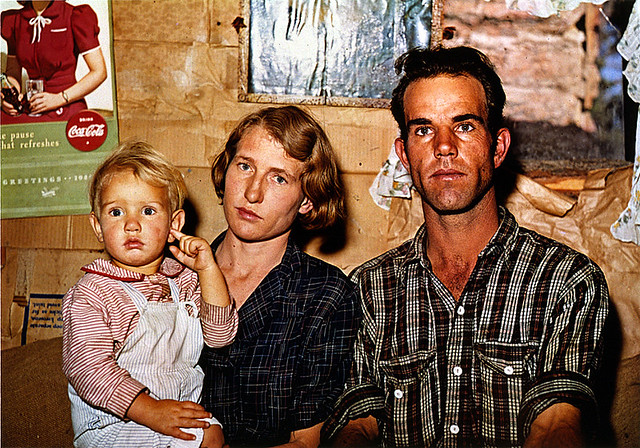
JackWFamily_RussellLee
Russell Lee, Jack Whinery, Homesteader and Family, Pietown, New Mexico, September, 1940

The 31 photographers included in "Everyday America, Photographs from the Berman Collection," at Kasher Gallery cover more than 75 years of  America’s story, but the people and events scholars might deem the proper content of our national history are not here. Instead the photographers present a sort of hodgepodge history of images anyone might have noticed -- and possibly thought unremarkable. Here’s a partial list of subjects: houses, shopkeepers, vehicles, lovers, amusement parks, suburbs, couples, orchards, graves, dancers, motels, kids, train trestles, shoppers, barber shops (I could go on and on).
This is a different kind of history, and I don’t mean to make fun of it. On the contrary, arranging the pictures outside a historical context seems in keeping with their essential idea – they were shot in history, not about it. By not attaching the photographers’ names and picture titles alongside the works, the curators go further toward isolating the images in their own discrete moments (catalogs are readily available). I found the disorientaion refreshing. The experience became just me and the images – like peering though a viewfinder moving randomly through time.
And the pictures are superb.  Roughly grouped under the rubric of “documentary,” the photographers avoid sentimentality and (except for one mocking photo by Martin Parr) post-modern irony. Their tool of choice is most often a large, unwieldly 4x5 or 8x10 view camera, which requires fixed intentions and emphasizes clarity and specificity.
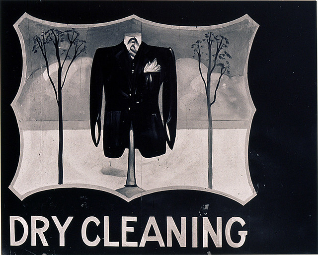
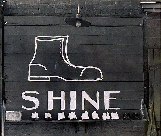
Arguably, almost all the styles in this show can be understood as versions of Walker Evans’ style. And, indeed, Evans -- with the largest number and often the best pictures in the show -- is the star here. We see, for example, his fascination with the art and language of commercial displays – he called them “the pitch direct” –echoed in pictures by Aaron Siskind and John Vachon and expanded to church signs and scribbled graffiti by Dorothea Lange and Helen Levitt.

DryCleaning_WalkerEvans
Walker Evans, Outdoor Advertising Sign (Dry Cleaning) near Baton Rouge, Louisiana 1935”

Shine_WalkerEvansWalker Evans, “Shoeshine Shine in a Southern Town, 1936”
It was Evans who first understood that the written word in public is important socially and aesthetically.  His homage to skilled and graceful sign-painting  in  Outdoor Advertising Sign (Dry Cleaning) near Baton Rouge, Louisiana, 1935” and minimalist white-paint-on-black board in  Shoeshine Shine in a Southern Town, 1936,” for instance, show us that – long before MBAs discovered them -- brands were, for good or evil,  indelible.   
Or they can be chaotic, as Robert Frank shows in his 35mm. New York street shot, “Untitled (Poultry Store Front), 1950s. ” In the shot a messy script, daubed on a sign above a trash-filled sidewalk, maniacally proclaims “1-pound giblets for $3” over and over and over.  This is Frank working characteristically against the grain. He is no doubt well aware that the signs’ thumbed-nose to craftsmanship represents a social change.  What has happened to Evans’ folk artist/sign painter? Is he drunk?   Or has be been replaced by a machine?
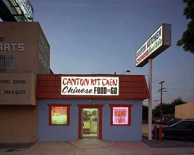
The transformation of the show’s themes over time is one of its great pleasures. For instance, John Humble, a west coast photographer has photographed the streets and buildings of Los Angeles in large-format color since the 1970s. His color shot of a low-slung fast-food restaurant, the show’s “12511 Venice Blvd, Mar Vista (Canton Kitchen), 1997” at first seems garish with multiple signs and neon windows.  But we soon understand that  Humble’s picture is in its way as modest and precise as one of Evans.

CantonKitchen

John Humble, 12511 Venice Blvd., Mar Vista (Canton Kitchen), January 8, 1997
What’s different in this picture (aside from the color) is the rest of the world. The Canton Kitchen itself, a place about the size of a Manhattan studio apartment, is crouched in the shadow of an appliance parts warehouse under an illuminated billboard and, on the other side, pushed up against a nondescript parking lot. Given this, and the fact that no one walks in L.A., it’s hardly surprising that four signs are needed -- one of them towering above the tiny building (Chinese FOOD to GO). We’re not in 1930s Connecticut anymore.  
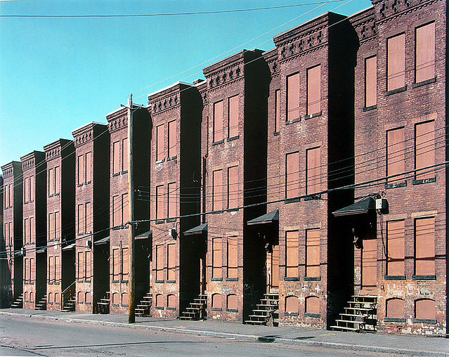
Numerous examples from the show make clear that Evans was drawn to deserted, closed and boarded-up buildings, a theme repeated here by William Christenberry, Jack Delano, David Husom and Mitch Epstein, among others. But where Christenberry’s freshly-painted white church, in Hale County, Alabama in the 1970s, for example, exudes hope despite the boards nailed over its windows, Epstein’s bricked-up factories in Holyoke, Massachusetts in 2000 emanate despair. Buildings have a spirit, just like living creatures.  

It was Evans’ great gift to infuse inanimate objects with a tender life most photographers grant only to other human beings. But, perhaps as a corollary of this, he seemed reluctant throughout his career to make intimate portraits, preferring to pose people in the midst of larger scenes, if at all. (An exception – perhaps a telling one – is his New York City series of subway portraits, shot in secret, spy-camera-style.)

BoardedRowHsesHolyoke_MitchEpstein

Mitch Epstein, Newton Street Row Houses, (Brownstone Building), Holyoke, Massachusetts, 2000
Could an unconscious aping of Evans’ people-shyness by curators or collector explain why so few portraits are in this show? It’s a real surprise, given the size of the space, that all the significant people pictures can be grouped in one corner.  Clearly, this is not because they’re unconvincing or weak. On the contrary, this section of the show may be its liveliest.
This is in spite of the fact that many of the portraits in “Everyday America” are not “everyday” at all. They are classic black and white prints by Dorothea Lange, Margaret Bourke-White and other Depression-era shooters of refugee families and young working men fleeing the dust-bowl.  These dramatic pictures are interesting, but there’s something musty and old-fashioned about them. They were widely published at the time and are now so well-known as a genre it’s hard to really see them clearly. But then comes an early color shot by FSA photographer Russell Lee to pierce through the decades.
In Lee’s picture, “Jack Whinery, Homesteader and Family, Pietown, New Mexico, September, 1940,” (see it top of this review) a handsome young working-class man and his blonde, blue-eyed wife, holding their toddler son, stare resolutely into the camera.  Behind them is the cardboard-covered wall of their new rough-built shack with plastic stretched over an unframed window. A swatch of flowered fabric for curtains is tentatively pinned up near the window. A Coca-cola poster is hanging on the wall. 
To me this picture says, “We are a God-fearing, can-do American family, and we are not afraid.” My question might be, Why not? The Great Depression is still hanging on, and another great war is looming in Europe.  Yet, as a viewer, I believe in this family. Here in America they’ll make it, I'm sure. In the final reel, I tell ourselves, everything will work out.

RedHairedFamily_MitchEpstein
Mitch Epstein, Ybor City, Florida (Mother with Brown Paper Bag), 1983
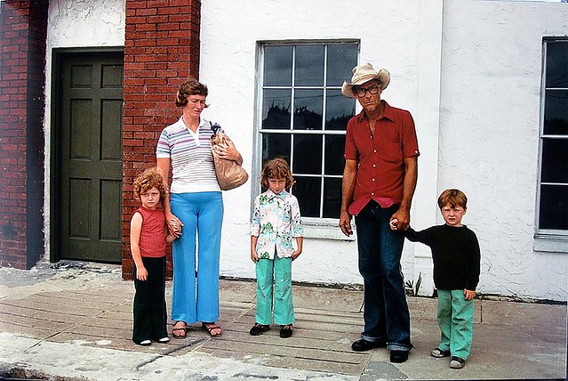
By 1983, when Mitch Epstein made “Ybor City, Florida (Mother with Brown Paper Bag), ” belief is harder to come by. In Epstein’s picture a thin man in a ragged straw hat glares belligerently at the camera. Behind him, dressed in cheap, ill-fitting clothes and clutching an old paper bag, his wife and three young children stand apart, round-shouldered, looking down at the sidewalk or off to the side, anywhere but at the camera. They are waiting for the shame to end. But it won’t. 
What has changed?
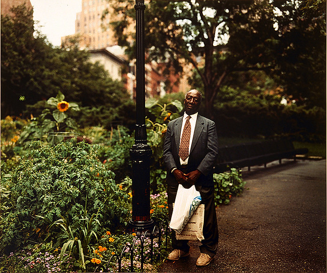
Flash forward to 1997. Joel Sternfeld ‘s “A Man Walking Home, Washington Market Park, NYC” shows a well-dressed late-middle-aged black man standing by a lamppost in a lush city park in an upscale neighborhood. The man leans back, smiling, balancing two shopping bags. We see that he is next to a garden. Tomatoes are growing. A sunflower nods its golden head. The man’s mood seems peaceful, friendly. After so many years, he looks like he feels at home.  
BlackManNYC_JoelSternbergJoel Sternfeld, A Man Walking Home, Washington Market Park, New York, August, 1997
What has changed?

Wednesday, March 6, 2013

Other Landscapes Under the Sun


Michael Benson’s “Planetfall” at Hasted-Kraeutler        Reviewed by Tim Connor


 MBenson_UltraVioletSunBlog
"Ultraviolet Sun," Michael Benson, All rights reserved
 Human imagination has been soaring into the heavens for millions of years, but it wasn’t until 1961 that Russian cosmonaut Yuri Gagarin actually left Earth’s atmosphere.  Between 1969 and 1972 twelve Americans walked on the moon, but that’s as far as human bodies ever got. Increasingly, in recent years, space travel has meant virtual ride-alongs on remotely-piloted robotic spacecraft with engineered senses. It is from these otherworldly robots that writer-photographer Michael Benson mined visual data for his powerful exhibit, “Planetfall,” at Hasted-Kraeutler.
To show the solar system “…through the lens of art,” Benson used raw frames culled from NASA and European Space Station missions from 2000 to 2012 (astonishingly, all spacecraft data is free and stored on the internet.) “It’s all online. I browse from home,” Benson says of his method.  He curated by “…sifting through tens of thousands of raw frames – in effect panning for gold.” Next came image processing, compositing and mosaicking to make the final photographs.

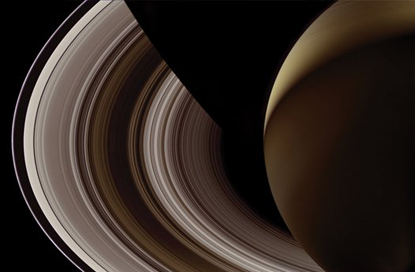
It’s no surprise that “Planetfall’s”  images are technically extraordinary. Some of the pictures of Mars, for instance, were made with NASA’s HIRISE camera, which has a 19.7-inch aperture, allowing it to render images of one foot per pixel. Such cameras create images that astonish, not only because they really exist but also because they seem impossible (or faked). The show’s images of Saturn’s rings, for example, have a rigid, abstract geometric precision that makes them appear to be machines. On the other hand, Io, Jupiter’s highly volcanic fifth moon, looks like a hunk of pocked and mouldy yellow cheese.
MBenton_NightSaturnBlog
"Saturn at Night," Michael Benson, All rights reserved
But science is only the beginning here. Without some emotional content most of the pictures in this show would amount to little more than strongly-lit dead rocks or migrating cauldrons of swirling gas. Benson’s art is to make the distant, inhospitable places in our solar system seem accessible, if not to human travelers, then at least to a viewer’s feelings. One way he does this is to emphasize universal commonalities – shapes, colors, gravitational logic, the behavior of wind, light, fire and so on.  We see how alien it is out there -- but it’s not so alien we can’t feel connected.

Benson explains this approach with a quote from theoretical physicist Werner Heisenberg: “We have to remember that what we see is not nature herself, but nature exposed to our method of questioning.” In “Eclipse of the Sun by the Earth,” for instance, an orangey-red hemisphere of sun emerges from Earth’s shadow literally boiling --in fact, half-exploding -- with heat.    From the writhing gases on the sun’s surface, hellish flowers seem to be blooming, their centers blazing  with incandescent yellows. A viewer is hard-pressed not to back away from this ferocious image. And this is not just a reaction to its imagined heat. This sun appears to be in a violent rage. We can feel its uncontrolled wrath. There is danger in this wrath – and beauty too. We can glimpse why ancient people gave such strong personalities to their god-planets and stars.

MBenson_SunsetMarsBlog
"Sunset on Mars," Michael Benson, All rights reserved
It’s interesting that Benson finds very different metaphors in his pictures of Earth’s nearest sibling, Mars.  The planet’s red rock and sand deserts , barren valleys and far-off low ranges of hills are not so different from views found on our own planet. Thus Benson’s “Sunset on Mars” is weirdly familiar, even with its tiny, distant sun and magenta-tinted atmosphere.

Why, I wondered, is this Martian sunset so much more melancholy than any I’ve seen on Earth?  Perhaps it’s because this and the other Martian photographs in the show seem to bear out a mood detectable in our long-standing, obsessive fantasies about vanished civilizations on the Red Planet.  The NASA photographs are detailed; they show no canals. Yet the Mars in these pictures seems spent, desolated; its time over; its ripeness gone. Something must have happened ...

MBenson_HomewardBoundBlog
"Sun on the Pacific," Michael Benson, All rights reserved

Here I’m in mythical territory, of course. But perhaps I’m not being whimsical. Could the cautionary feel of the Mars pictures reveal an aspect of Benson’s curatorial intentions? Here’s a piece of evidence. My favorite picture in “Planetfall,” titled “Sun on the Pacific,” shows a softly curving Earth horizon pushed up against an inky black crescent of space. When I first gazed at this picture’s large-scale print on the wall, I felt oddly weightless, a speck floating dreamlike above blue and pink clouds that framed a golden gleam of sunlight on a peaceful ocean.  And then I realized my point of view – the point of view Benson had chosen for me -- was a spaceship cruising the last leg of its homeward journey. And the Earth had never looked more beautiful.
More evidence. In a recent interview Michael Benson said the following: “I’ve looked at thousands of images [of Earth] from space over the last few months, and many images show evidence of planetary distress. For instance you can see smoke filling the air of the entire continent of South America due to the burn off of jungles. My view is that an honest look at the early twenty-first century solar system needs to include visual evidence of climate change here on the third planet. “
Also published in New York Photo Review, 03/2012